Project overview
Since 2002, MindaClient has provided a CRM for over 6,000 users in the scholarship, business, charitable, and caring sectors. I worked on the platform’s user interface design and created the first Design System for the application as part of an ongoing company project to revitalise the website design.
The challenge
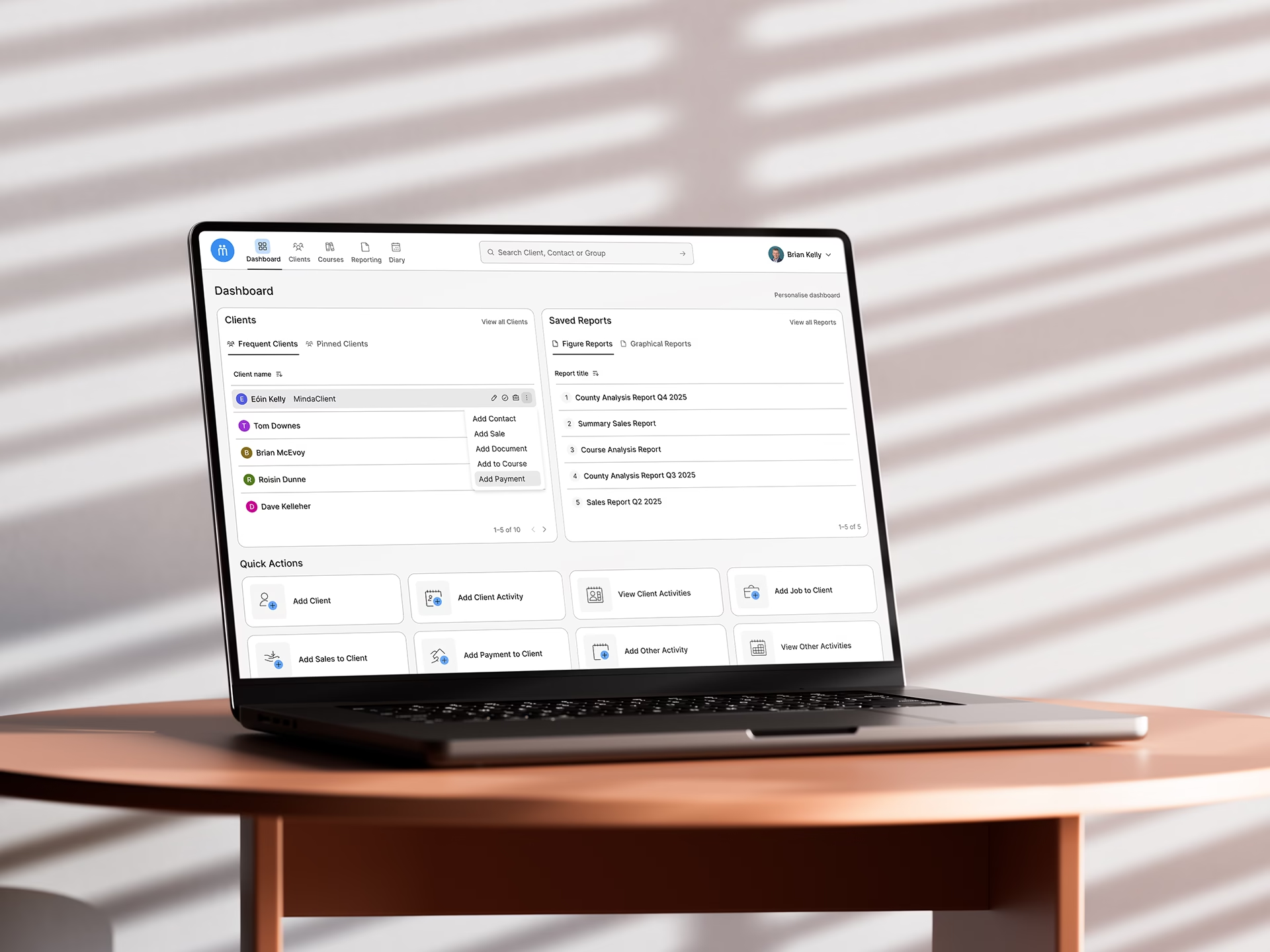
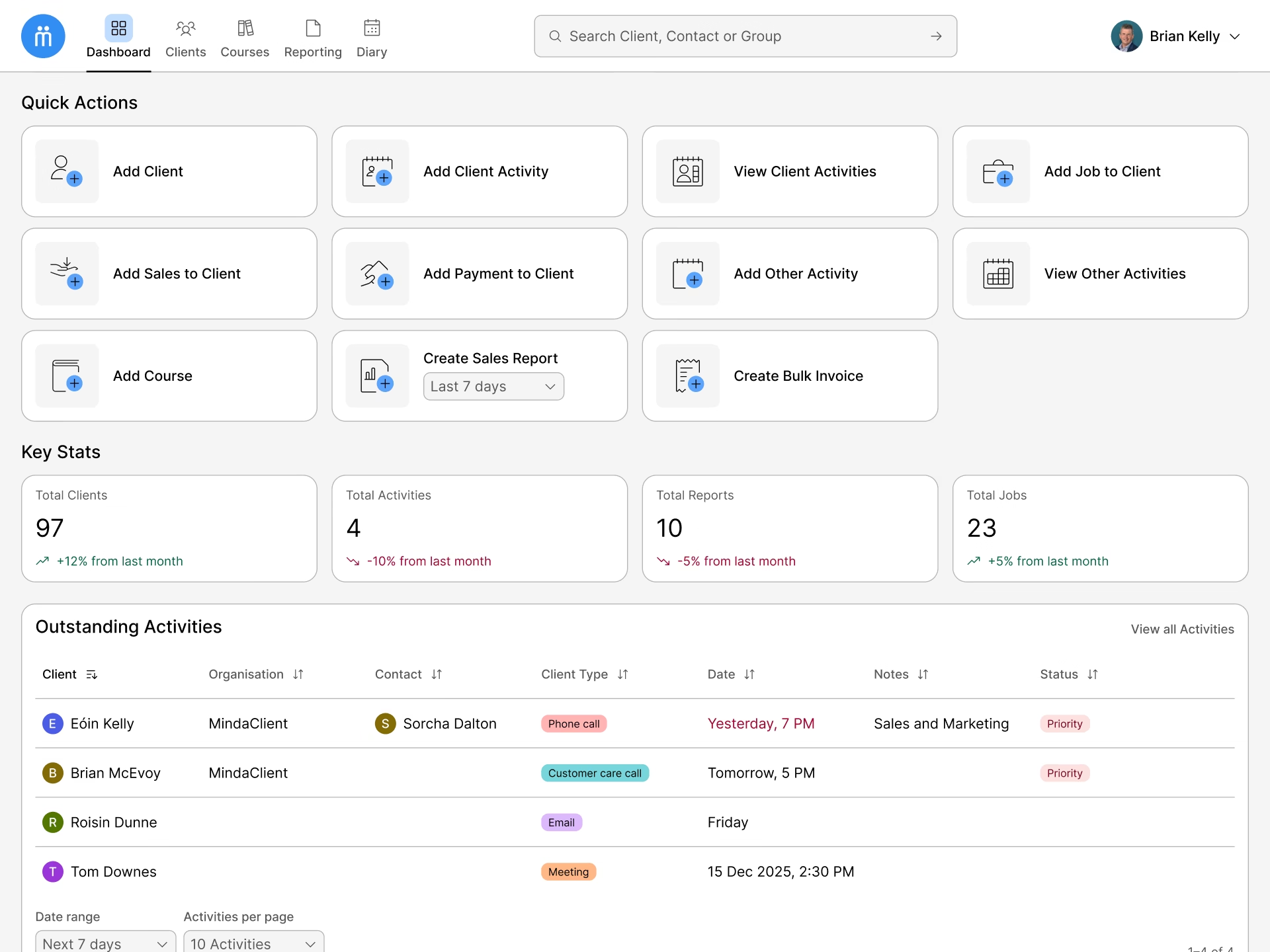
I was tasked with updating the user interface design of the platform’s dashboard as well as documenting the design decisions with the creation of a Design System for MindaClient.
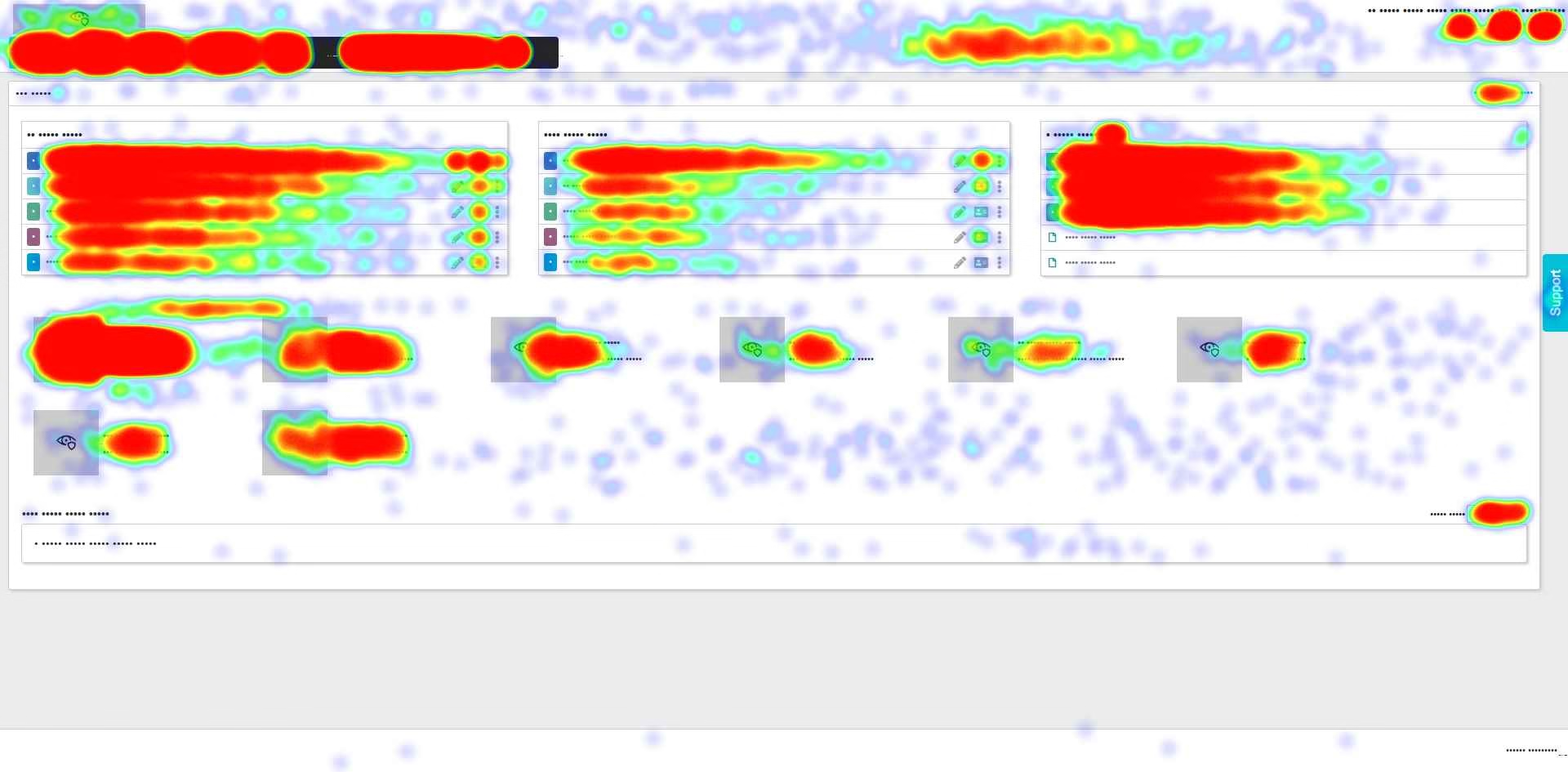
One of the main challenges was the lack of in-depth behaviour analytics tools on the platform, besides basic Google Analytics reporting. I introduced Hotjar and Microsoft Clarity to the team for heatmaps and session recordings.
As there was no established design guide, it was important to structure the design by building on incremental best practices, designing for accessibility from the start, as well as focusing on consistency, scalability and longevity of the design decisions.
It was learned from a company survey done in 2024 that the average MindaClient user is a well-educated adult in the 35-50 age bracket.
Starting the process
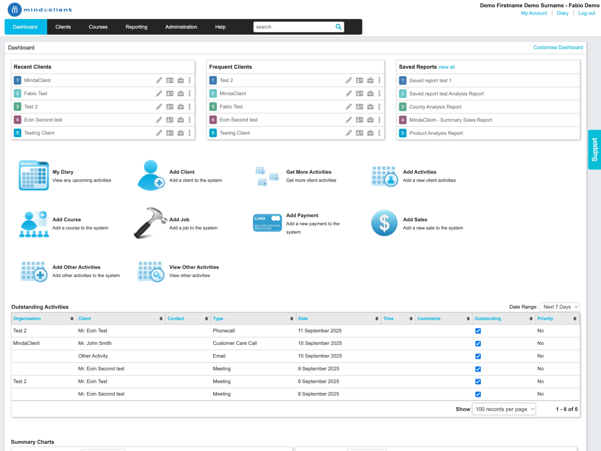
From the most common desktop device size data from Google Analytics, I started to produce a first black and white draft of the dashboard respecting the constraints from the development team regarding the overall structure of the elements on the page.
Following best practices, I defined initial acceptable font sizes and spacing based on multiples of 8 with the goal of introducing a design foundation for MindaClient.
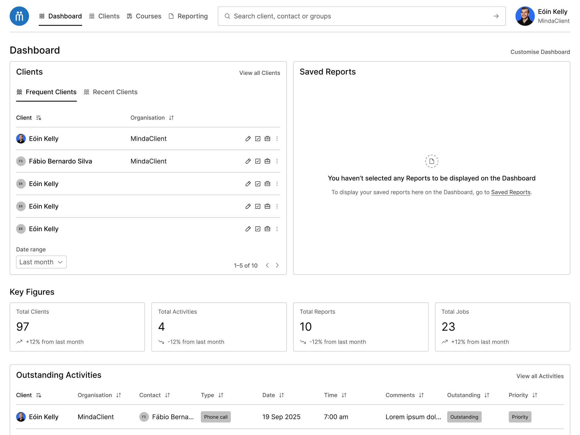
The insights from heatmaps and session recordings, gave us the confidence to support some design decisions in the dashboard, such as moving the support tab and help button to a submenu, and moving the Diary to the now fixed top navigation bar.
A 1.2 / minor third typographic scale from the 16 base font size was used as the foundation of the type system. The resulting values from the scale were rounded up to nearest multiple of 8, and these informed the text size in the different areas of the interface according to the element’s role and importance.
A family of icons from Phosphor Icons was introduced to replace the outdated and inconsistent icons used in the interface, and to identify the main macro areas of the application that are presented in the top navigation.
Evolving the design
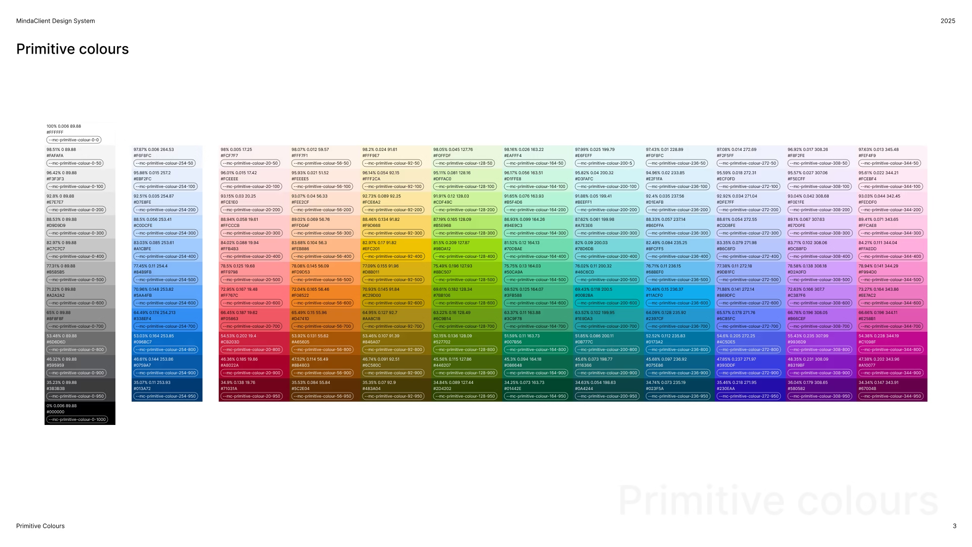
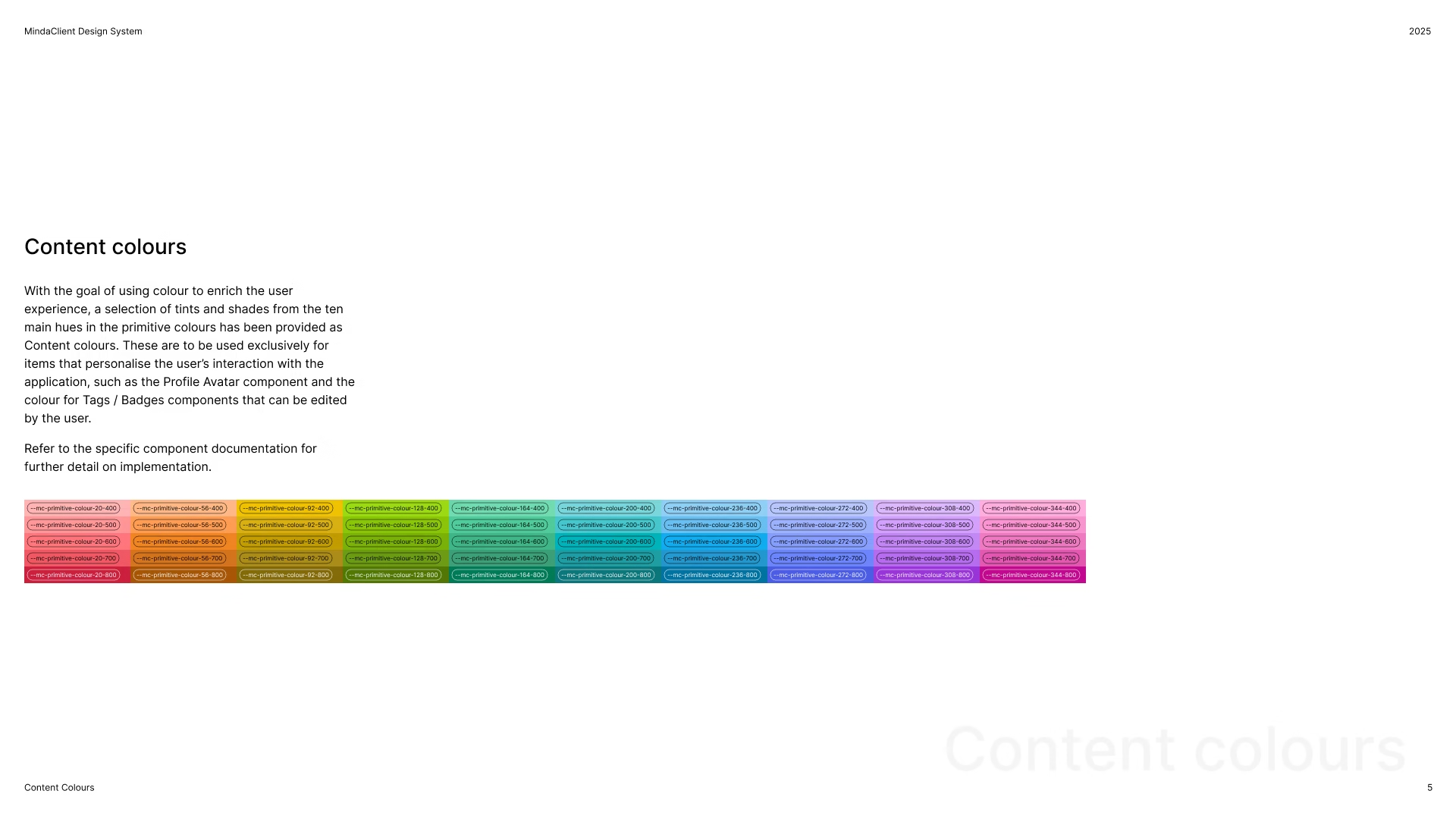
In order to bring more nuance into the design, I developed a colour system for MindaClient. With the objective of achieving accessible colour contrast combinations across a wide array of hues, as well as future-proofing the design work, I built the colour work based on the OKLCH colour model. Differently than HSL, with this model it is possible to achieve a consistent and predictable colour results based on the chroma or luminance of the colours – which is the idea of the perceived brightness inherent to a colour hue.
After many iterations I established 10 distinct hues in the colour wheel for content colours, to be used in user customisable UI elements, such as badges, tags, and profile avatars. Each hue was then turned into lighter tints and darker shades based on the needs of the user interface in terms of colour roles and the WCAG accessibility standard, with AAA as the goal.
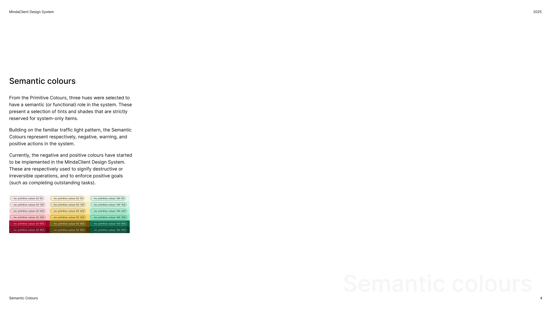
A set of semantic colours was created by reserving a selection of hues, tints, and shades for their functional role in the system. Another measure introduced to prevent conflict with the semantic colours, was the decision to make only a selection of tints and shades available as content colours.
The neutral greys are used to bring more definition and weight to the interface and are used in surface, border and text elements. Greys can be used to determine role, such primary or secondary, state such as active, focused, and hovered, as well as providing highlighting in some contexts. The brand blue was selected to grab the user’s attention and focus and are used to denote selected elements and action items, such as buttons.
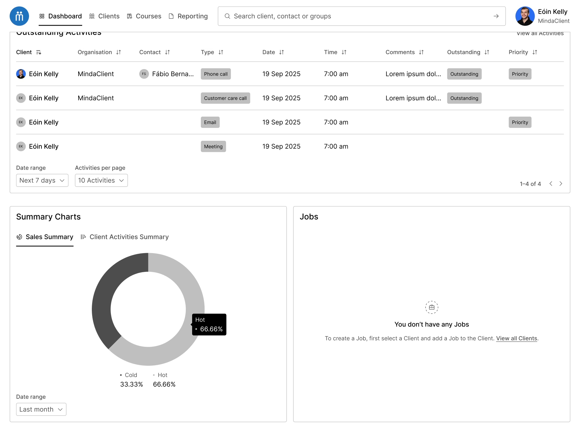
A second icon family from Steamline HQ was customised to replace the 3D style imagery for the quick actions area.
Design System
With the completion of the dashboard design, I moved into documenting the design decisions by creating a Design System for MindaClient. This living document is structured by presenting foundational design elements, such as colour, type, spacing, and icons, as well as reusable components that are used to achieve design and development scalability.
Following best practices, variables were setup in the Figma prototype by following a layered aliasing approach, primitive variables that are not directly referenced in the designs, are consumed by context-specific tokens specific as aliases.
Next steps and learning
Understanding that the scope of this project was the initial dashboard screen, next steps for MindaClient include designing for all the other areas of the application, as well as reviewing and expanding on the design foundations built to date with a strong focus on best practice.
As the OKLCH colour model is becoming the reliable accessible standard in interface design, this project was a big learning opportunity for me in exploring this colour model and further deepen my skills in digital accessibility.