Project overview
LOOP is a web application I designed as part of the Google UX Design Career Certificate.

Understanding the user
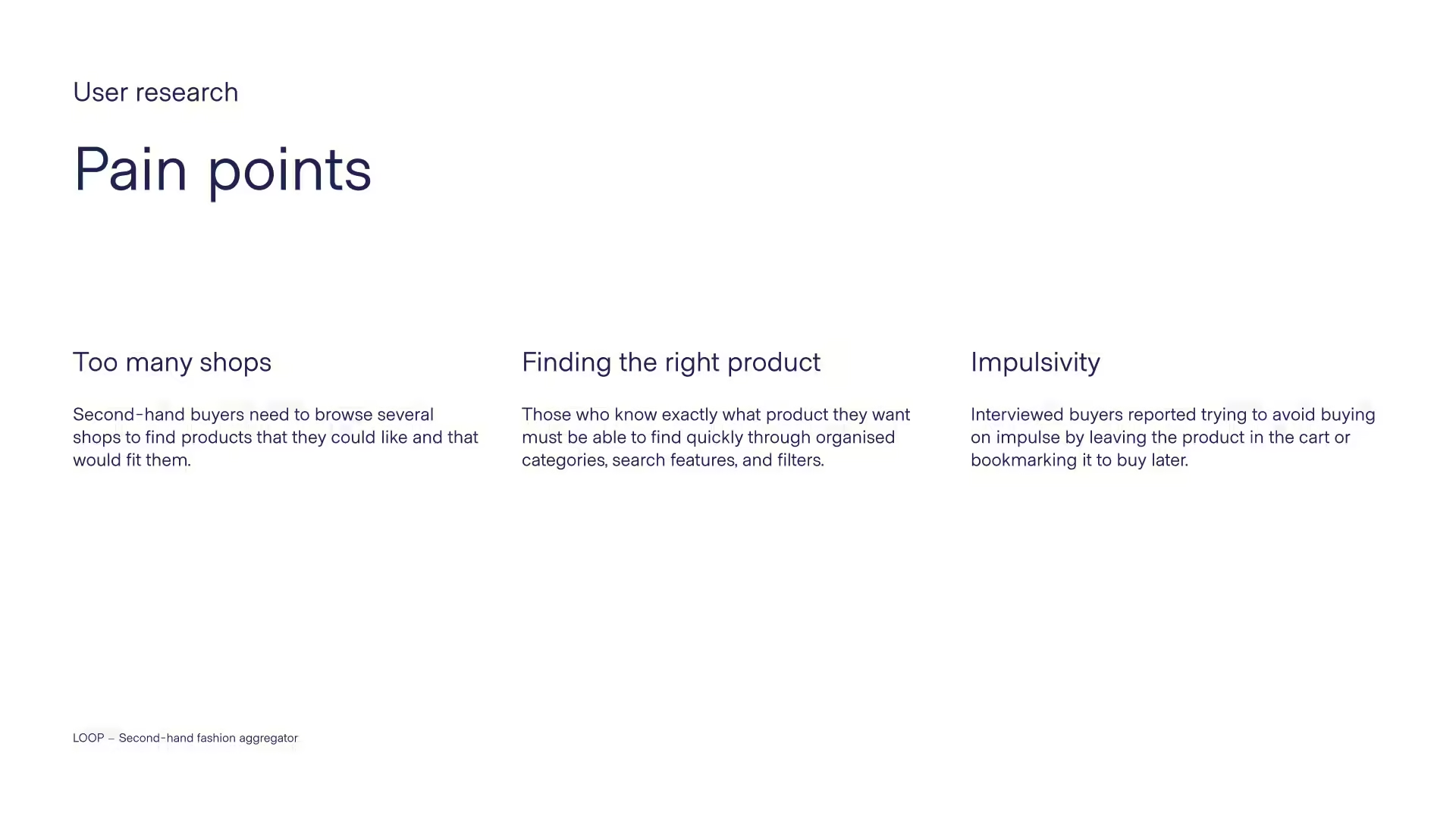
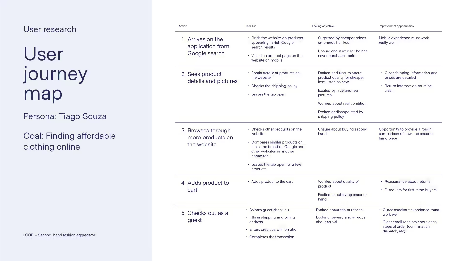
In order to better understand the user, I conducted interviews as primary qualitative research. The interviews had the goals of understanding common behaviours and expectations in the process of shopping second-hand online as well as learning about needs and frustrations (pain points) of the different user groups.
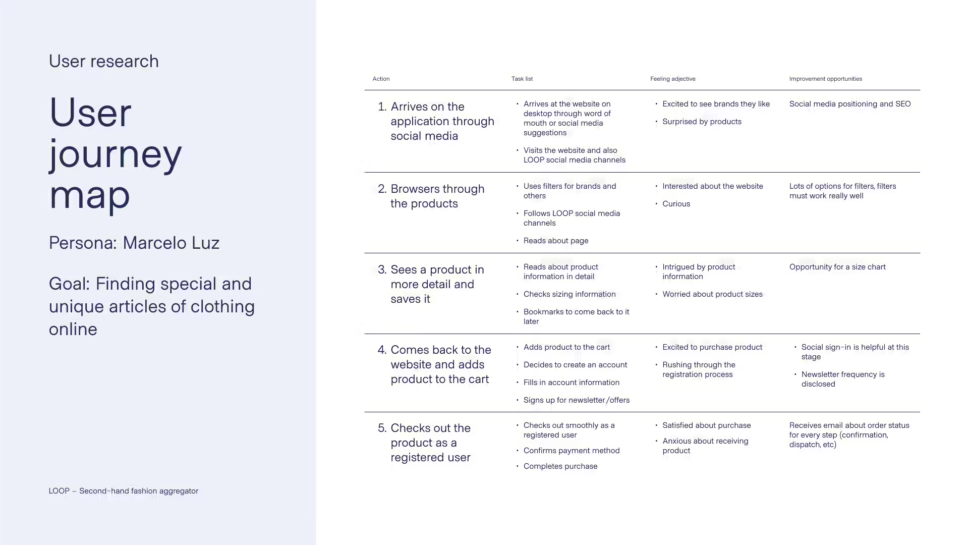
I produced 2 personas and their problem statements, as well as their unique user journey maps that helped inform the requirements for the design.
Starting the design
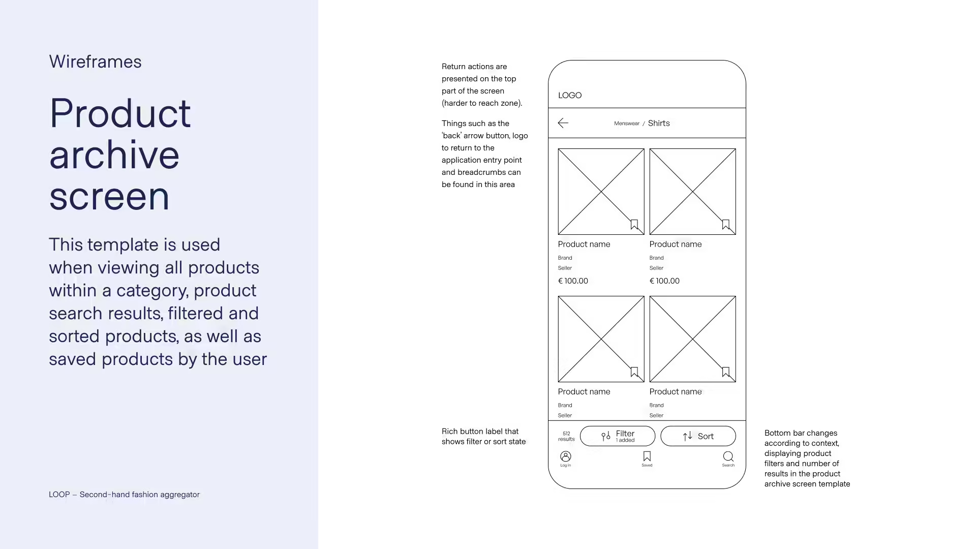
I produced paper wireframes to generate different options for each screen while keeping the user needs in mind. When moving to digital wireframes, I focused on a mobile-first experience by placing controls for useful actions in the easy to reach zone of the screen. This is the reason the search bar, saved products, as well as filters can be found on the lower area of the designs.
At this stage I also produced a low-fidelity digital prototype that was used for usability testing.


Usability testing
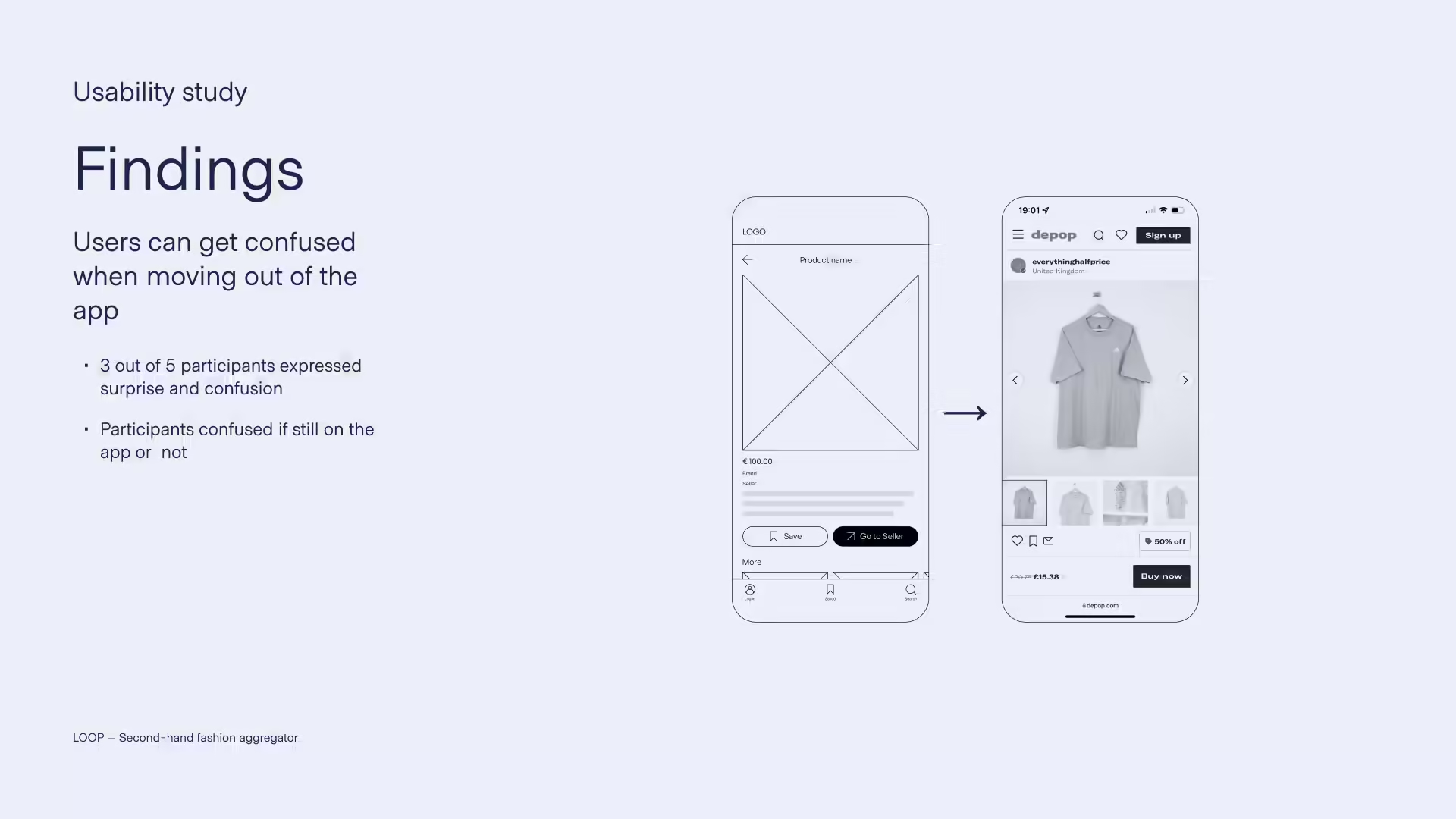
I prepared a usability test with 5 participants. They were given a series of tasks to complete on the low-fidelity digital prototype. The participants were asked to attempt one task at time and ‘think aloud’ by describing their thought process as they proceeded to complete each task. Finally, after each task, the participants were also asked to answer how difficult the task was and if they would change anything in the process.
A screen recording of a participant in the unmoderated version of the study can be seen below.
Refining the design
After analysing and synthesising the data and patterns from the usability study, I could come up with insights on how to refine the design focusing on improving the experience for users.
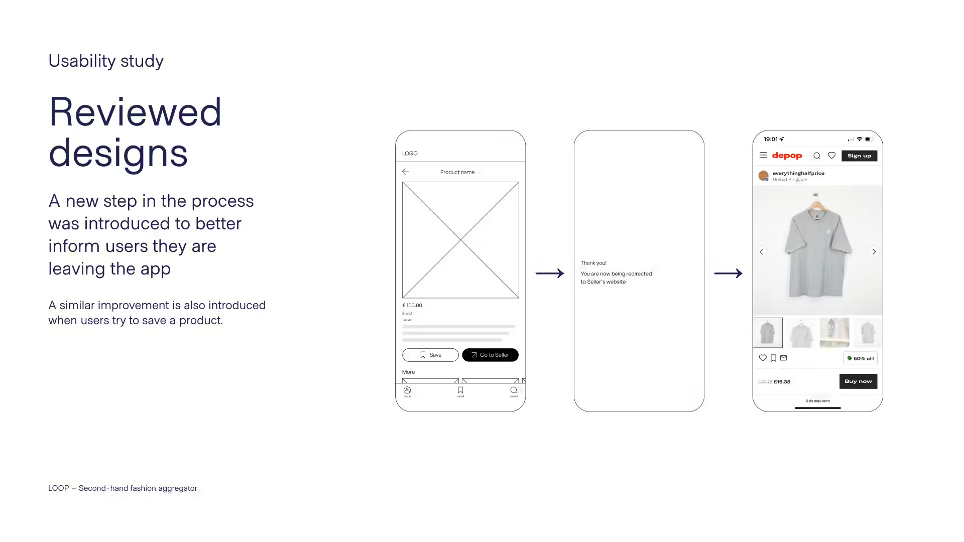
I noticed a small and brief surprise or sometimes confusion when some participants were redirected outside the application. As a way to address this, I introduced a new step in the flow to inform the user they are being redirected. Based on this, a similar improvement was also implemented in the process of attempting to save a product as a logged out user. Now a panel animates in and invites the user to log in to save and view saved products.
Another example of an improvement based on an insight from the usability study was enlarging the hit target of the list-style buttons as seen in the filters. Before, users had to click on the icon to proceed, and many study participants attempted to click on the whole list item or on the text in order to proceed.
High-fidelity design and accessibility
In the process of producing the high-fidelity design, I defined a colour palette and a clear type scale for the different components of the design system. I tested colour contrast for accessibility according to the Web Content Accessibility Guide (WCAG) 2.0. After adjusting colours accordingly, the updated designs conform to the AAA level.
Desktop design
Based on the existing mobile design, I worked on the desktop design by designing wireframes focusing on the user needs. I defined a different type scale as well as different sizing units from the mobile design due to the difference in the screen size.
I then produced high-fidelity designs and a digital desktop prototype to showcase how the responsive design of the application changes from mobile to desktop.